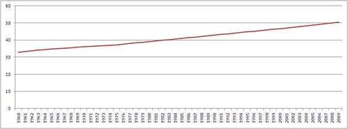
Well, you won't have noticed, but the World Bank recently announced that more than half the world's population now live in urban areas. The UK hit that mark in 1851. I think Scotland hit it at something like 1821 because of the Highland Clearances. Anyway, the graph looks like this:

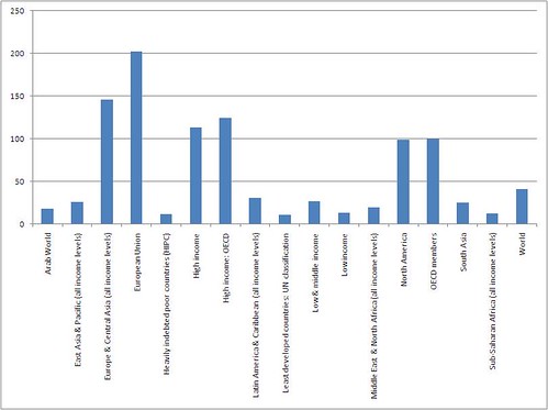
The World Bank has an amazing data site so I downloaded the metadata for the numbers for countries. Extracting from this I produced this graph of percentage change in urban population between 1960 and 2009:

Which is more interesting than the World picture really. If you look at it, most of the urbanising has been happening in those countries that have had the fastest growing economies since 1960. Note the EU urbanizing rate of over 200%. This chimes with what I know of the German Economic Miracle and the "Celtic Tiger" growth of Ireland being driven in great part by agricultural developments freeing up labour to move to cities and provide reasonably cheap, skilled labour.
Which kinda links to what led me to getting this data, the fact that because of the industrialisation of agriculture many of the "brownfield" sites in cities now have greater biodiversity than you get in the countryside. Like the wonderfully named Nob End, near Bolton.
My mate's dad has some wonderful photos of urban biodiversity over on his flickr stream.
No comments:
Post a Comment